
Introduction
This is the era of smart phone and internet. People spend most of their time in mobile phones, whether it is seeking information, or purchasing or even prefer mobiles for watching TV programmes. Henceforth most of the web design companies in Chennai think of designing websites that could have the power to attract mobile visitors and drive lead for their customers. Indeed, nothing could be a better channel than mobile to reach more and more people.
Why does your business need to focus on mobile users?
In this world of mobile devices, you can see people attached to two different platforms – Android and iOS. There may be many reasons to justify their love or hate towards that software, the one thing that unites them in usage is website use. They will be fond of and inclined towards using the website that works well on their smart device screen.
The web world is a vastly different landscape than we think. Do you know that 68 million searches are carried out on mobile devices around the world? Wondering? Just ask your web design company. They can provide you with statistics that will make you to think of influencing mobile users.
Mobile users are really a force to reckon with and that is the reason why marketers must take them into consideration for ensuring long term success. Well, we have something to ask you. Have you asked the following questions to yourself?
- Which one my customers prefer to search on things whether desktop or mobile devices?
- Do my users majorly rely on mobile phones to seek for the things?
If you get ‘Yes’ for both of the questions, then you should gear business towards creating a website for alluring that mobile users from a reputed web design company in Chennai.
While the average usage of desktop browsing are still counts, the thing is slowly getting surpassed by the mobile surfing as smart mobile phone usage increases.
As the number of person accessing the internet via mobile phones increases, providing an easy experience for such mobile users in your website is becoming priority. When you design the website covering the most needs of mobile users you are ensuring a pleasant user experience to them and trust building and lead generation towards your business.
Before day, a decade ago, mobile usage and users were an afterthought in the process of most of the web design companies. It needs not to be emphasized based on them. But this is not the case now. The slow decline of desktop usage with the rise of mobile phones has shown that website design has to take priority of mobile users.
Not focusing on mobile users is a sin in the age of UX design. Delivering a pleasing user experience should be the heart of your business strategy and the same is suggested by experts of well developed web design companies in Chennai in order to cope up with growing importance of mobile world.
Making your website best fit for mobile users – Tips to make things happen
Right, we have seen the need for making your website suitable for mobile users. So how can you do that? We are here to help you! Let us focus on the crucial steps thinking responsively and consequently concentrating on the aspects that make your website adaptable to mobile users.
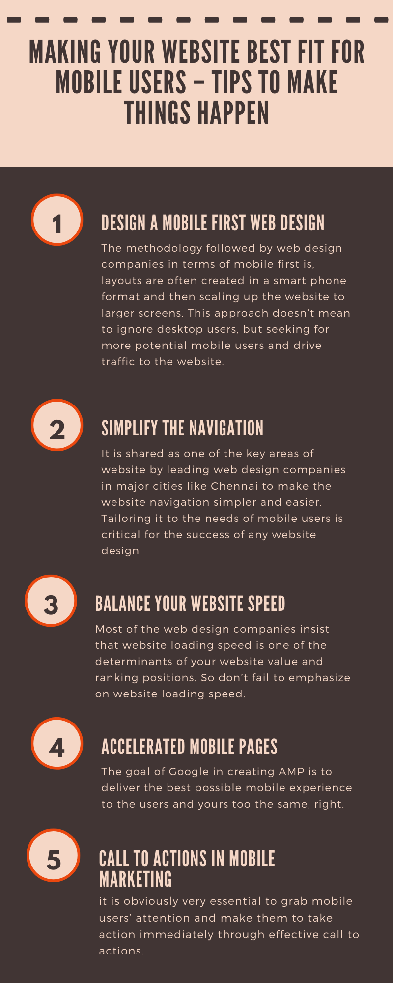
Design a mobile first web design
With this trending strategy, mobile first website design is given priority by most of the companies in web design field. Until before, development of desktop versions is considered and are tested and made work for different screen sizes. Industries also favored such desktop oriented websites that are accompanied with elements like special graphics and visuals (e.g. flash design). But that design work well with larger computer screens but creates difficult for mobile users.
The mobile first website design rearranges this strategy and focused on optimal solutions for mobile devices. The methodology followed by web design companies in terms of mobile first is, layouts are often created in a smart phone format and then scaling up the website to larger screens. This approach doesn’t mean to ignore desktop users, but seeking for more potential mobile users and drive traffic to the website.
Simplify the navigation
It is shared as one of the key areas of website by leading web design company in Chennai in major cities like Chennai to make the website navigation simpler and easier. Tailoring it to the needs of mobile users is critical for the success of any website design. The best practices often recommended by website design companies are:
- Limit your website navigation
- The optimum number of menu links is at least 3 and not more than 7.
- Always keep in mind of users’ priority
- Ensure consistent navigation throughout the website design
- Make sure that you do not confuse the visitors in making moves in the website
- Make them guided properly where they are in website and make it easy to move around other web pages.
- Balance your website speed
Why are you thinking to make your website mobile users friendly? Of course to improve your business! So doesn’t it necessary to make your website loading speed improvised to accommodate that fast moving mobile users. A recent study says that even a seconds delay of your website have impact on your conversion rate. Actionable tips shared by experts of web design companies:
- The major culprits that hinder your web loading speed are images and videos. The more images and videos in your website the longer it will take time to load. So optimize the images and video files using compressor to make sure it doesn’t impact on website speed.
- The quality of your web hosting too has considerable impact on your loading speed. So check with major web design companies in Chennai to pick for the hosting that suits well for your needs and boost the website speed performance.
- Enabling browser cache feature will store necessary elements on viewer’s hard drive and thus increases website speed.
- Though use of plugins seems to be attractive option, it contributes to slow website loading speed. So remove any plugins that you don’t absolutely need.
- Compress your web pages and style sheets using Gzip. This can reduce the website page size by up to 70% which can drastically reduce transfer time.
Most of the web design companies insist that website loading speed is one of the determinants of your website value and ranking positions. So don’t fail to emphasize on website loading speed.
Accelerated mobile pages
Heard of the term Google’s Accelerated Mobile Pages (AMP)? If not, here is the explanation for you. It is an open source platform designed to boost up the loading times for mobile internet users. Already we mentioned that mobile searches have overtaken desktop. This too often considered by professionals of web design companies who are locations like Chennai. AMP is found to be a good idea since it is specifically designed for creating websites that load quickly as possible especially on mobile devices. The goal of Google in creating AMP is to deliver the best possible mobile experience to the users and yours too the same, right.
Content marketing
The goal here is to tailored and rearranged content for your specific audience group rather than offering a stripped down version of your website. Mobile users will expect a harmonious experience across all the devices and platforms. Delivering the right content that is viewable on all devices is considered to be an effective content marketing. To ensure the content is prioritized right way, think about the goals of your mobile visitors and how you are going to achieve them. Ensure while reading they should not have to zoom. For the best pleasant mobile experience, web design companies prefer the Google recommendation of contrast ratio of 4.5:1 for texts except for a very large one.
Call to actions in mobile marketing
Think of the emails you have received from the brands. Have they enticed to read and do further? Perhaps the motivating images and the interesting contents may have pulled your attention with killer call to action button. As mentioned earlier the desktop is now subset and incredible converting to mobile devices, you have to work on mobile audience.
Ensure that your call to actions is finger friendly to attract them. If you have a glance at the analytics provided by top most web design companies in Chennai, you will see that mobile session time is lesser compared to desktop and bounce rate of mobile is higher. So it is obviously very essential to grab mobile users’ attention and make them to take action immediately through effective call to actions.
Keep considering fonts
Think of the website text displayed on the mobile screen doesn’t make the users to zoom and creates a frustrating experience. Neither Google nor other major search engines like poor mobile user experience.
All the website text contents need to be large enough to read on various devices without zooming. This is the primary need of designing the website considering mobile users and building mobile friendly websites. Also ensure appropriate font size and style depending on your brand and demographic. The foremost point that you have to keep on your mind is your web design company gives the ability to users on their mobile that they can read website content easily without zooming.
Avoid pop ups
Want to make your website mobile friendly? Just avoid pop ups. There is nothing more irritating than clicking on a link and being distracted by pop up. It reduces the overall user experience. Even small pop ups can annoy the mobile users. This is because mobile browsers typically don’t support pop ups. For best mobile results, avoid pop ups though out your website design.
Since mobile being the hot favorite over millions of people, business marketers as well as web design companies in Chennai consider them as friends of internet and design things consciously keeping the mobile users in mind. So don’t make your amazing website get disappointed by the users with pop up ads.
The take away
Having your online presence nearly a decade is merely not enough to meet the demands of today’s modern users. If any of your customer visits the website through their smart phone and have lesser smooth experience, your business will have the chance of losing that customer. Since the future of internet lies in smart phones, unless your website is friendly for the mobile users, you will be outsmarted.
Making your website mobile friendly is not an optional but a requirement to be successful. If your website is not mobile friendly and could not give customers a compelling experience, it sit eh time to seek the support from a prominent web design company in Chennai and get on board for setting your business for mobile success.