Does your website get as many visitors as you like? Are you getting the most bangs for your precious investment? If you are not ensuring that your website is designed in such a way that it not only appeals to your target people but also performs well in bringing new opportunities to your business, then it is the time to frame a thoughtful strategy.
As websites play a major role in digital marketing these days it's important to know the mistakes that affect your sales. Here goes a list of common web design mistakes that you have to avoid to make the most of your website and get the desired performance from it.
1.Ignoring mobile users
When you could see more website visitors on mobile devices than computers what could a website be benefiting you if it is not designed in a way that a person couldn’t view properly on his mobile phone?
As a renowned web design and development company in chennai we would recommend businesses that they have to remember one thing that their visitors are closely watching your website. In case they have a poor mobile user experience then it will be harder for the website to rank in the organic search listings.
If you are concerned about your website and thinking of making it as best web design for mobile, we are there with our vast web design services from a reputed web design company in Chennai that you need. We are very proud to help you with our best team of extensive web design experience and knowledge to create a great mobile friendly website for you. Digital marketing companies know well about the strategy towards reaching the target audience. You should not concentrate on one medium alone. Your users are available in multi channel mediums. There is no doubt that your website reaches desktop users for sure. But for mobile users also your website should be easily loadable and readable.
2.Not having a clear call to action
It’s great that you are getting the visitors to your home page! Now what is the next great thing to do? What do you want them to do? Absolutely you need them to be converted as your paying customers.
So your web design should not be a hurdle point by having poor call to action. Your customers should be able to smoothly navigate through your website to encourage them to take action.
Apart from focusing just on designing as a popular web design company in Chennai we also understand your business objectives and very sure that call to actions are considered a critical arm of your organization; we do the best in achieving that.
3.Slow loading speed

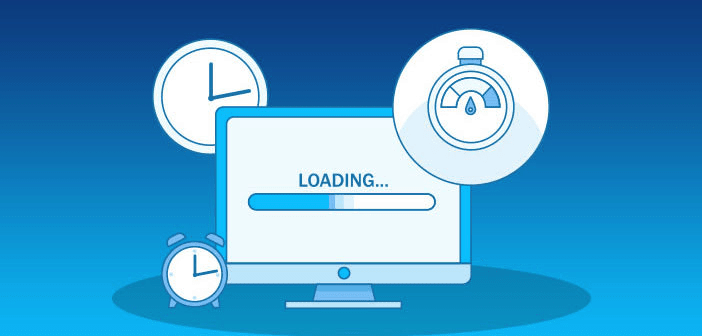
We would strongly say that a slow loading website is a major web design mistake. It’s just not related to what is on the visual on the page but also matters a lot to the website visitors. This is because they want to see the content as quickly as possible.
Since typical customers expect the website to load in less than two to three seconds, they will leave the website if it doesn’t.
We don’t say that your audiences are bad; it is natural for the people to get frustrated waiting for the page to load. It is just normal behavior. So what could you do? If you think that your people are not getting the information faster and it doesn’t happen in a click away, it’s time to avail the web design services from a reputed chennai web design company like us!
In fact, even a second delay in page loading time can cut the conversions by 7 percent. So don’t delay it. Use our services to make your website speed faster as you wish.
4.Annoying Pop-Ups
Have you ever clicked on a link and then gotten a pop up that leads to a new page to sign up or read content? So how does it annoy you to see something that is irrelevant to you or blocks your view to read the content that you looked for. Frustrating, right? Then you shouldn’t give the same experience to your audience.
It may be very tempting for the business websites to use pop ups to drive the attention of visitors. But before you decide to implement popup overlay on your website, just ask yourself
- Do you have any other more friendly way to achieve the goal?
- Do you have the confidence that the users remain engaged with your pop up?
- Are you measuring the level of engagement of leads achieved through pop ups?
- What do your users feel about your website pop ups?
If you ask us as a leading web design company in india we would say that best pop ups are those that don’t force the users to interact with that. We don’t encourage putting the visitors in a stressful situation and force them to switch tasks and make decisions.
Our website designers test for pop ups on multiple mobile devices and recommend user friendly options. We set timing rules for pop ups so that they will be least intrusive and be most likely to convert. Thus we ensure that it doesn’t break down the mobile experience in any way.
5.Too much information overloaded

The worse web design mistake that bombard your website visitors is providing excessive information on your website. You have all heard about information overload.
In most cases people prefer condensed data presented in a more appealing manner. Our web design services agency suggests you to avoid information overload people adapt a natural filter that tune out which is irrelevant to their preferences.
Avoiding excessive information on your website that is not directly connected to your main point is the best idea for your excellent web design.
So this time a question may arise in your mind, whether making straighter to the point makes visitors bland. Your question is valuable, but don’t worry. It is not like that. When you are able to convey the required information in the short and relevant style, it will draw more attention not only to your website design but also to your brand.
Do you have the best data? Come to us, as the best digital marketing company we will help you to express in a more organized and interesting visual style based designs.
6.Improper usage of images
Although images are an important aspect of your website, dumping images aren’t going to the job that you expect from your website. We are sure that you have heard of the term ‘Picture is worth a thousand words’.
So being the fact, after your conscious and continued efforts on crafting your website don’t wimp out on the visuals with improper use of images. That is why our experienced web design company cares for your website’s improved user experience by utilizing images that are appropriate for the expectations of target group audiences.
Have a glance on few of our guidelines that get the most of your images:
- Images that could trigger emotions and memories makes your users engage well.
- Make sure the images you choose don’t slow down your website speed dramatically.
- The foremost image that you could find on any of the websites is ‘Logo’. Since the logo takes a special place, keep it always positioned in the same spot of every page to give visitors the safe feeling of where they want to be.
- For the images you use on your website you should have the purpose of choosing that one and placing it at the right location.
As a leading web designing company we pay special care to background images that can create a unique atmosphere for your website.
7.Creating under optimized website design

You will be very well aware that SEO is vital for any online marketing. Keeping in that mind, our professional and skilled designers of web Design Company in Chennai care for the optimization of your website.
Since under optimized website design manifests in slowing the website speed we are also concerned that the design we make meets your website performance.
We recommend to our clients that website optimization is the necessary and needed part in the web design phase itself. Let us reveal the reason behind that. Because so many elements like website structure, adding required website pages and formulating link structure are going to be implemented at this stage.
And with a forthcoming touch we don’t want you to go back to redesign such elements while you move for doing SEO for your business website.
With web designing companies chennai who are capable of developing SEO friendly websites you can avoid such tedious and costly processes in website design.
8.Little or insufficient website content
When it comes to design or Search Engine Optimization contents are the best friend for your website in achieving the best part. Constrain in offering budget for multiple pages or whatever be the reason if you narrow the necessary website contents, this strategy leads to a bigger web design mistake.
Also the content you provide on your website should be specified in a clean and uncluttered manner. Being a top notch web design services offering company we pull out the sufficient and quality information from your team to make useful to the audience. While auditing your website for SEO, digital marketing companies check for quality contents to drive valuable queries for your business.
Moreover we always ensure that the contents are within the standard eye pattern for easing up your website visitors. After all, all the websites are crafted with the purpose of being familiar and functional for high usability.
Read More About Climb The Peak With Tailor Made Dynamic Website Designing
Conclusion
The lower the usability of the website in designs, the harder it is for the customers to get interacted with. The mistakes you make in your website not only affect your brand reputation, it also has consequent effects on your profitability.
When you hire a professional web design and development company in chennai like us, it is possible for the designers who have understanding in design concepts avoid those mistakes that make the difference to the success of your website.
Given that website is a long term investment you should pay special care and attention to your website design.


