
Introduction
It may not surprise you that smartphones have become our go-to companion for almost everything these days. With everything available at few clicks or taps, people use it in their daily life needs. Hence it is obvious fact that mobile responsive website in no longer an option to think of, it is as important as your online presence.
Still, don’t you have no clue about making your website mobile friendly? It is 2019, you have to go beyond the old strategies and already Google has started to push towards mobile users. Thinking of how to make it done; let us discuss the ways to optimize your website for adopting mobile users.
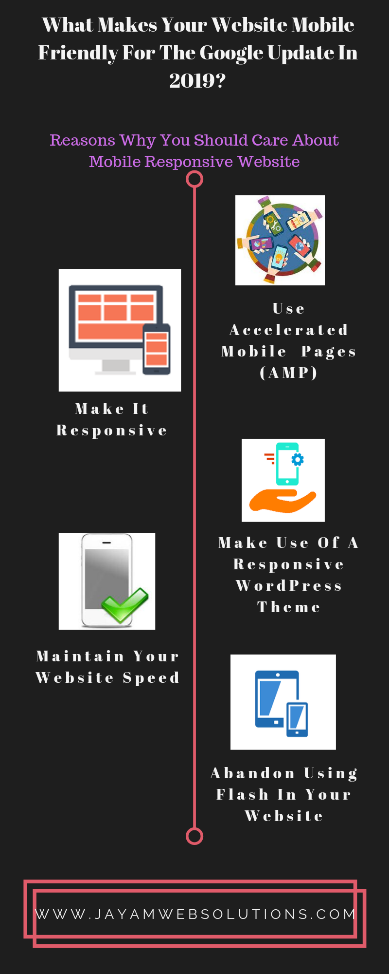
Reasons Why You Should Care About Mobile Responsive Website
Before we move on to the topic of how to make your existing website to mobile friendly, let us peep into the reasons why your website mobile-friendliness is an absolute must.
It is an emerging trend
While still desktops are still in major use, people are shifting towards the smartphones for browsing the internet for online shopping, banking needs and bookings like travel needs and entertainment. As with mobile responsive web design, the aim is to offer the viewers a single website that respond to the different screen sizes of the devices and provide users a seamless user experience.
Hence the people don’t want to scroll the device or zoom in for viewing contents. Remember, today busy people don’t like to take any additional steps to view websites. So it is pretty safe to design your website to be mobile responsive for the prospective users.
Give your users an easy access
Rapid growth in number of mobile users is a great sign that chances of accessing your website on their mobile phone is higher than on a desktop. But if your website is not responsive then you will lose out your users.
Furthermore, everyone is busy with their schedules and hence offering them an optimal experience without compromising leaves a lasting impression with your brand. So making your web design as responsive is a necessity. Also customers in every industry want to get the searching information quickly and in convenient way. If you don’t have an optimized website, you can’t offer your customers those comfortable experiences.
Boosts your rankings
Search engines too have started to follow the mobile trends with increased mobile users. This is the most valuable reason to make your website responsive to favor Google and influence rankings. Having mobile friendly and responsive web design helps search engines recognize and crawl them.As responsive web design involves same URL and HTML irrespective of devices used to access the page, it makes Google explore and index website contents easily. So ultimately you can enjoy better SEO rankings with your mobile responsive website!
Cost effective solutions
If your website is responsive to mobile devices, you don’t have to care about designing a new website that favors mobile users. Also your website display will remain the same even it is accessed from different devices, as responsive design adopts multi-screen devices. So there is no need of designing or maintaining a separate website for desktop or mobile users. Doesn’t it sound good in terms of cost and time savings?
When we again get into SEO ranking which is explained earlier point, it massively enhances search Engine Optimization marketing efforts and makes huge difference in your promotion budget. This is because most of the Google searches are made through mobile devices. Also an exciting thing is you can incorporate your social media profiles in your website to grasp mobile people. Mobile optimization helps to reap the benefits of social media advertising with improved efficiency and efficacy.
Greater user experience, Happy customers
When your potential customers access your website to get some information or thinking to make a purchase, you should offer them nothing but ease of experience with convenience. As most of the people use their smart phones to get in touch with you, providing a mobile friendly web design is the best way to give promising user experience.
With integration of devices accompanied with easy accessibility brands offers their users unhindered User Experience whatever the device they access from. Your presence on multi-platform has greater contribution towards brand reputation. So your mobile users will gravitate towards your visually appealing and mobile responsive websites. Results, Happy customers! When your customers are happy, they will make their visit often to you and encourage their friends and others through word of mouth.
Faster website loading, influencing buyers
As the name suggests, it is mobile! Mobile responsive websites accessed from pretty much anywhere and any device that impulse buys. People are not hanging on into the idea of purchasing when they experience slow loading websites. They don’t want to wait until the page loads. They want it faster and now!
If they hit a website that have slower loading speeds and hard to navigate they will take their business to your competitor. We are sure that you don’t want to lose your valuable potential customers. If yes, then it is not so late to make your website mobile friendly through a professional web design company. The better the experience your user face, the more the chances they are to purchase. There can be only one first impression, make it sensible and great!
Keeps you ahead with modern and trendy design
The online world is known for its fastest and drastic changes. Having your responsive web design protects your business from interrupted business flow with updated mobile trends. Mobile friendly websites ensures your consumers are offered with best possible user experience regardless of the device, thus hitting the market.
You may offer useful unique and valuable products or services, unless you have great mobile experience you can’t be seen as digital giant in your arena. Mobile friendly websites are contemporary, cutting-edge and help you to get your foot in the door of those who has a smartphone.
Building Responsive Web Design – Tips To Make Your Website Mobile Friendly
Make It Responsive
Before we discuss about making the website responsive, the very first thing that has to be addresses is what type of website you are going to build. Building mobile friendly web design requires some considerations based on its intended use for website owner. We have heard of the most known type’s static and dynamic website designs.
A static website is the one where the contents changes very rarely, whereas Dynamic websites requires frequent modifications in the website. Once you have decided the architecture of website, then you have to make your website works seamlessly on all devices and adapts to all screen sizes. Whether you are going to choose static, dynamic or custom website development it is up to your business needs and requirements. Whatever the type be, the common requirement for all these is responsive web design.
Responsive design means that your website fits to whatever the device the user is accessing. It may be big screen desktop or a small sized smart phone. Your responsive design should be flexible on any size of the device.
Abandon Using Flash In Your Website
You might have used adobe flash player in your website to display some animated features. You have aimed to show your visitors an eye catchy feature in your website. But have you thought of your mobile users? Most of the mobiles don’t support adobe flash unless the user has incorporated the option in his phone. When such person tries to access your website and it shows’ the feature is not supported in your device’, what will he do? He will immediately leave your website.
A lot of web design companies have abandoned flash in their web development as it uses too much hardware resources which causes slower page loading and hurts SEO ranking. Hence using flash in your website is not the best decision especially when making your website mobile friendly.
Image-Based Headers
If your website has image header, it will not display optimally on all the devices. Depending on the device used, sometimes part of the images may be cut off. Using the plugin responsive images wordpress you can create different sized headers to load on different sizes of mobile device. If the user is accessing from lesser capable mobile, then it will allow downloading the image in smaller file size.
Emphasize On Clear Content
Now and ever, you have to focus on seize the attention of readers instantly with clear and useful contents. Particularly when the website is viewed from smaller sized screen, you have to ensure that the contents have compelling headlines that makes the readers to have a great experience while he goes through your website contents.
Well defined and clear contents that led the users right to the point ensures that reader can view the material on their mobile devices without any distraction.
Maintain Your Website Speed
So now you are getting convinced with mobile responsive website designs? But what made you to think you so? Undoubtedly your need for business growth has influenced you to so! But do you know delay in loading of website has drastic effects on getting business conversions? Moreover you have come across that page speed is a ranking factor for mobile searches. Since Google is prioritizing mobile content, slow pages can affect your rankings.
Hence optimize your website speed for mobile devices. This involves image and videos optimizing, keeping your design and coding slim and lot of technical works. Leave that to an established web design company they will make your design mobile friendly and structure your website for smooth user experience.
Make Use Of A Responsive WordPress Theme
Most of the people find it as the easiest option and hence use WordPress to create websites as it is becoming a more popular choice in building responsive websites. It already has a responsive theme and so as soon as you finish the installation, you are done with mobile friendly with responsive feature.
If you already created your website in WordPress, you can search for a theme. Themes can be changed with few clicks and your website will have an instant fresh look with mobile friendly.
Use Accelerated Mobile Pages (AMP)
Accelerated mobile pages are an open source project of Google that creates mobile websites using compresses data which are consistent and load faster. This boosts the website speed and thus making it more mobile friendly. The features AMP HTML, AMP JS and AMP Cache make AMP as a pioneer in mobile optimization.
AMP has been broadly used by numerous leading companies, like Twitter, New York Times, and Adobe. This is because
- Accelerates better loading times in mobile devices
- Improves website visibility
- Improves servers performance through cache feature
- Mobile first strategy
This point may be mentioned as last in the blog but it doesn’t claim that it needs least attention. Mobile first design is a growing trend in the web design world. The idea behind this concept is developing the websites for mobile devices first and then expanding into for tablets and desktops. This approach is very useful for responsive and dynamic designs where the contents should be identical for both mobile and desktop page.
Summing up
With internet’s speedy takeover, it is an embarrassment for you as a website owner that not having a mobile-friendly website in the vigorous competition. If your website is not optimized for mobile, you are missing out a major chunk of audience group and their most attentive time spans. Are you ready to start your mobile responsive website? Take the above insights provided and act today. Make your website have a greater chance to thrive and produce better organic traffic.
The faster you react, the more capable your audience can find you, the more your business will prosper. So, enrich the mobile experience of your website and see your business growth accordingly. Good luck!